Giloo,
a platform focusing on documentary and nonfiction stories across a wide variety of genres and languages with paid memberships all over the world. Members can watch as much as they want, anytime, anywhere, on any internet-connected screen. Members can play, pause and resume watching, all without commercials or commitments. Giloo has grown to be a platform that enables curiosity to connect with realities and where you will consume, process and enrich your vision eventually.
Giloo has such valuable and meaningful films, but what stops its subscription growth while the blooming of documentary and nonfiction?
Giloo has such valuable and meaningful films, but what stops its subscription growth while the blooming of documentary and nonfiction?
Problem statement
Giloo’s core value, simplicity, is straightly reflected from the first landing on the home page. However, in the fast-pace and numerous competitors surrounding, Giloo has to be optimized continually. Take the home page for example, I find myself impatient to scroll it all the way down to find a film. Furthermore, there is 85 movies up front to choose but hard to know which one I am mostly interested in. As an end user, I am fairly lost when I don’t know where to start. Last but not the least, the consistent layout makes the page look neat but boring. The landing page is really attractive but the following same -size -square lists just turn the attraction down. Above issues might be part of the reasons that disconnect your product from users and also decrease the willingness to subscribe.
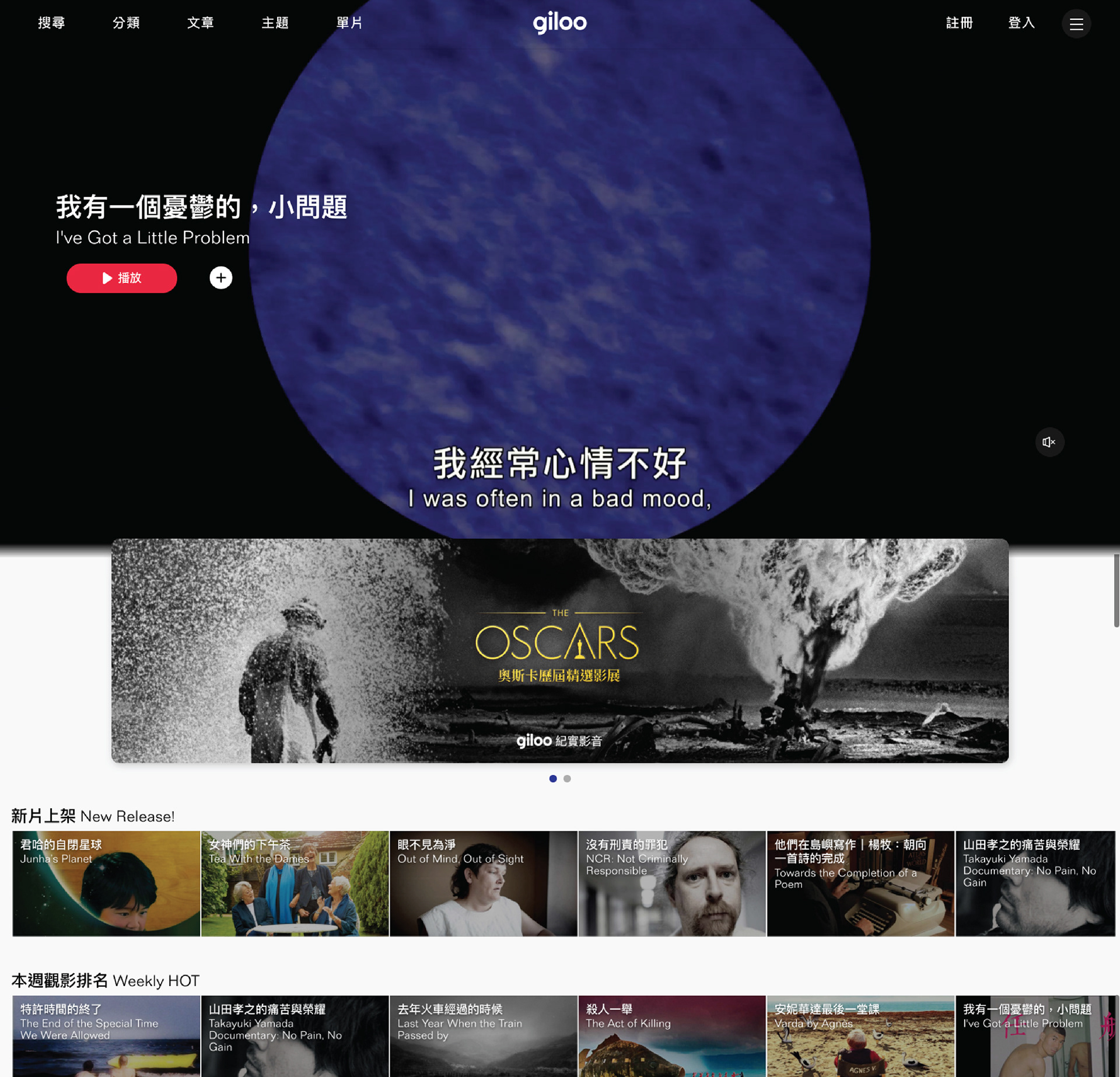

Screengrab from Giloo’s official website
I experienced a lower interest in subscribing to it although I understand how good this platform is in essentially. I believe it has happened to many other users and troubles not only me but also Giloo itself. Therefore, I searched on Google and after analyzed the comments from users I concluded three aspects:
1. Lack of interest to subscribe
Giloo’s focus group might think twice before they hit the subscribe button although Giloo has such an elegant taste of films. The reason might be that the ecosystem for Giloo is slightly different from other entertainment services. From a market perspective, whoever is addicted to Giloo must have a lot of time and patience. It might also explain the potential amount of movies that can be watched per month has already set an invisible obstacle for users to take further action.
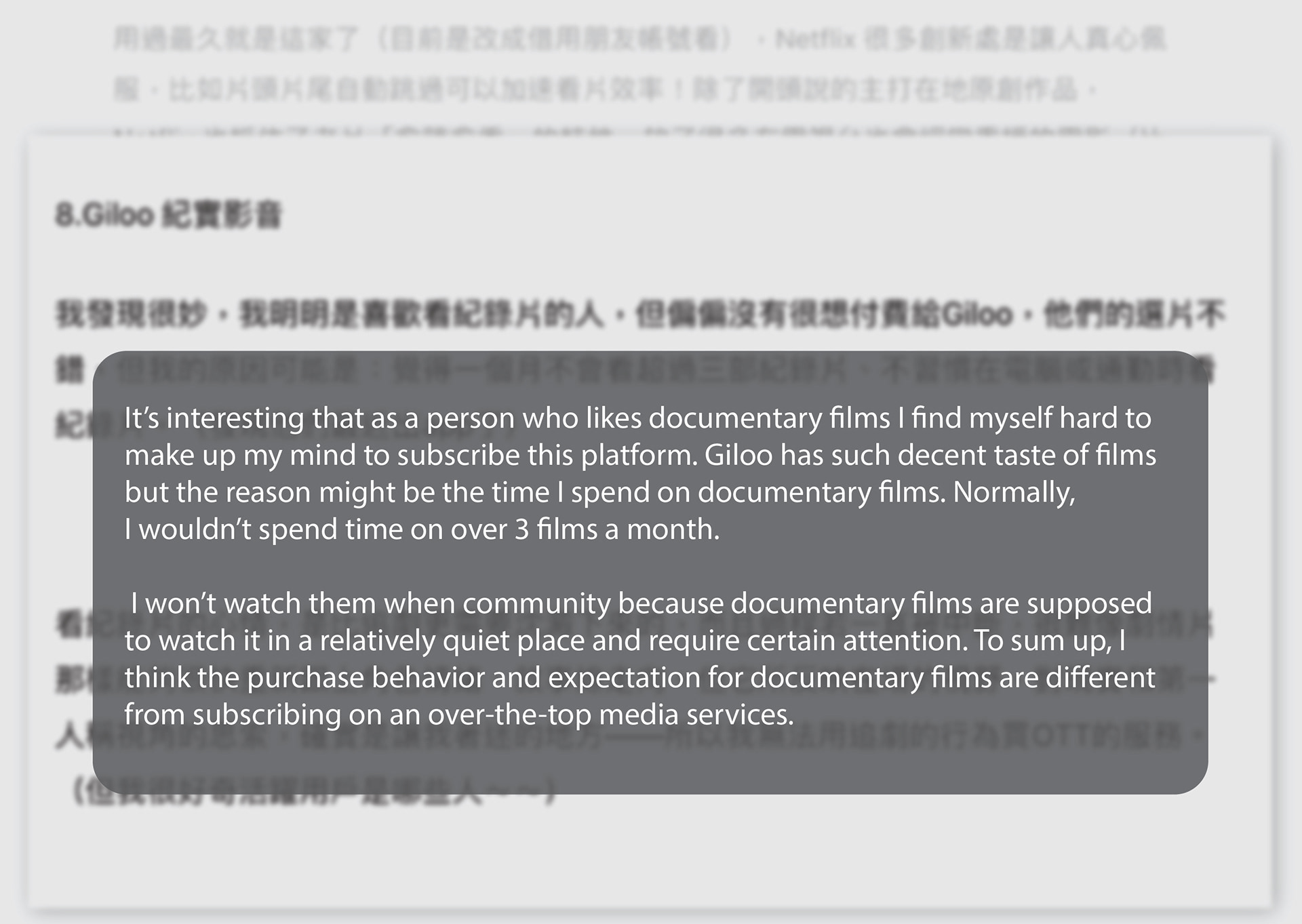
Screengrab from matters.news
2. User interface
In the current version, the user interface is pretty conservative which is not always bad. However, in Giloo’s case, the design could be more dynamic to inspire users to get involved. According to the below comments from users, user interface can be the next focus to investigate.
In the current version, the user interface is pretty conservative which is not always bad. However, in Giloo’s case, the design could be more dynamic to inspire users to get involved. According to the below comments from users, user interface can be the next focus to investigate.
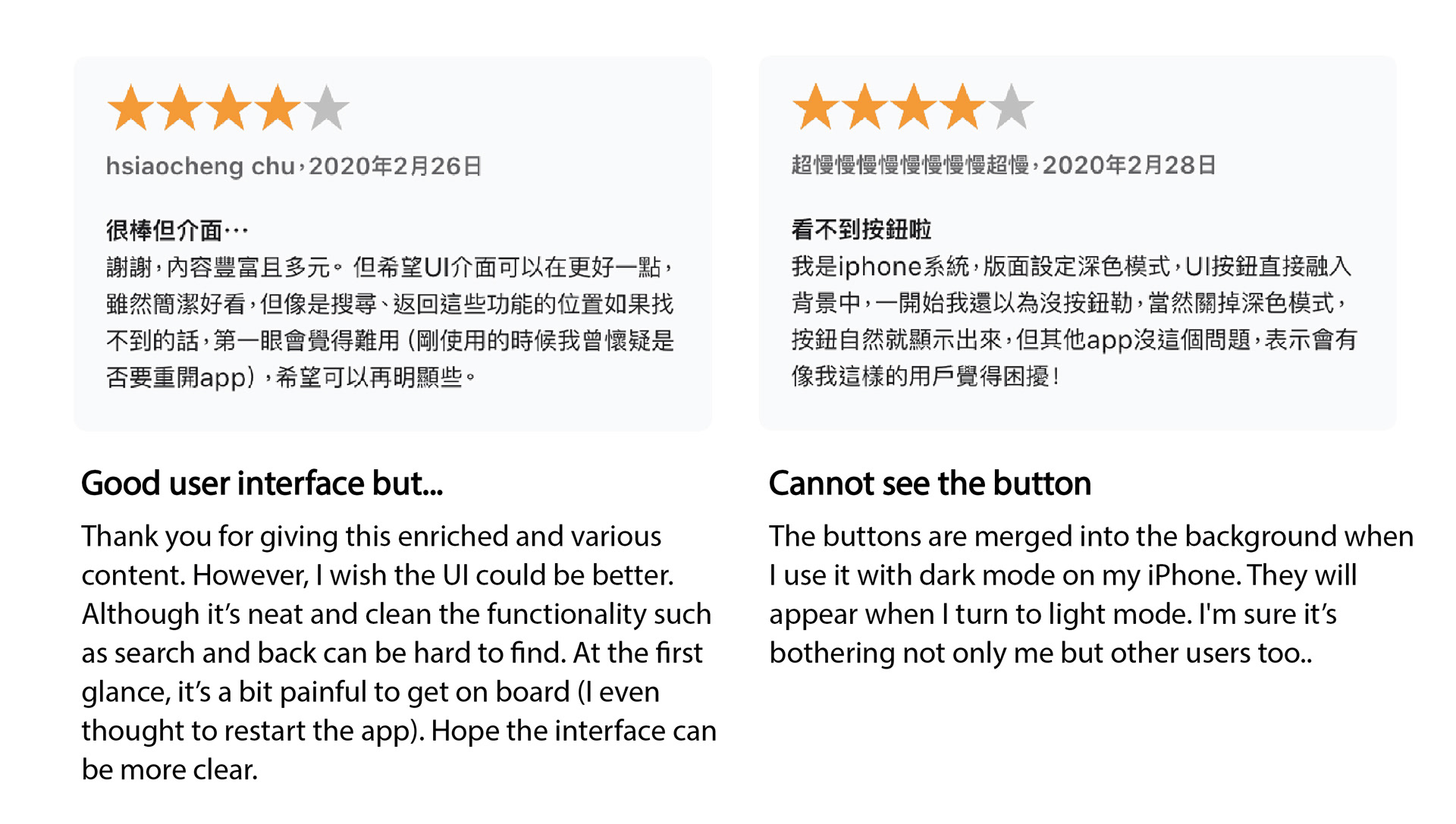
Screengrab from App Store
3. Marketing campaigns
On both Facebook and instagram, Giloo’s post always come with a photo and a short/long content. This again makes the page look orderly at the first glance but meanwhile refers to a lack of excitement and dynamism. Take one of the competitors for example, their page is composed with some short clips and series of photos that can stir up the flow of emotion when in use.
On both Facebook and instagram, Giloo’s post always come with a photo and a short/long content. This again makes the page look orderly at the first glance but meanwhile refers to a lack of excitement and dynamism. Take one of the competitors for example, their page is composed with some short clips and series of photos that can stir up the flow of emotion when in use.
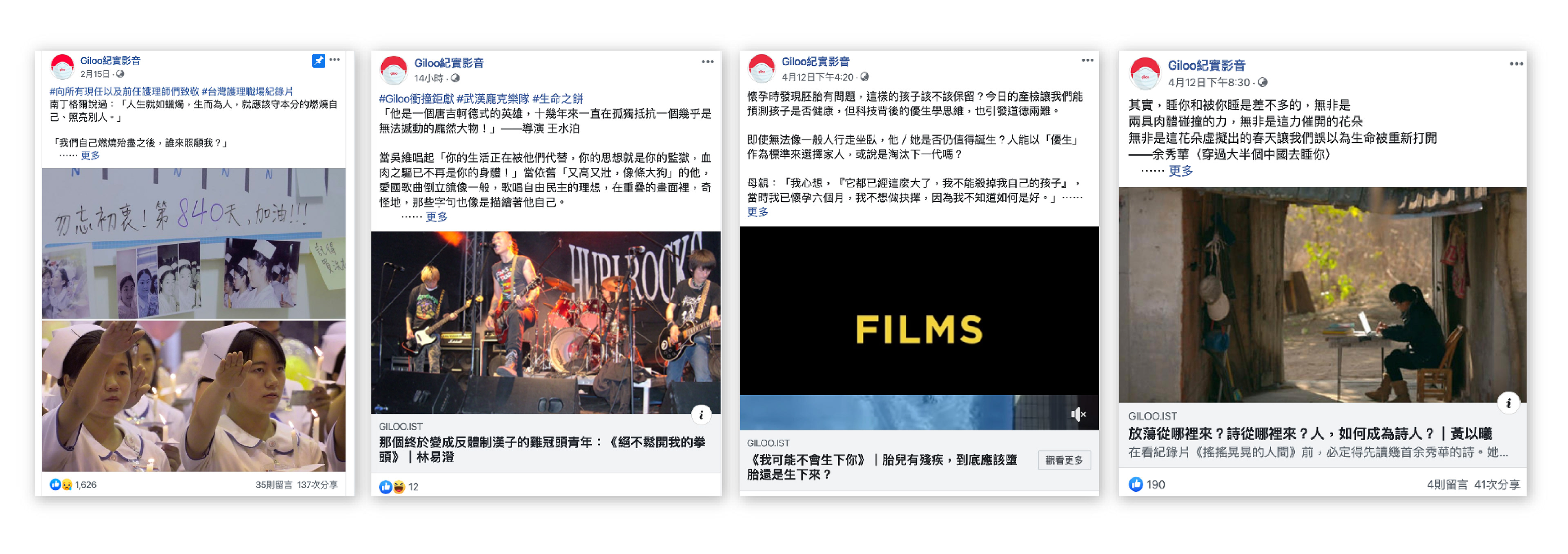
Screengrab from Giloo’s Facebook
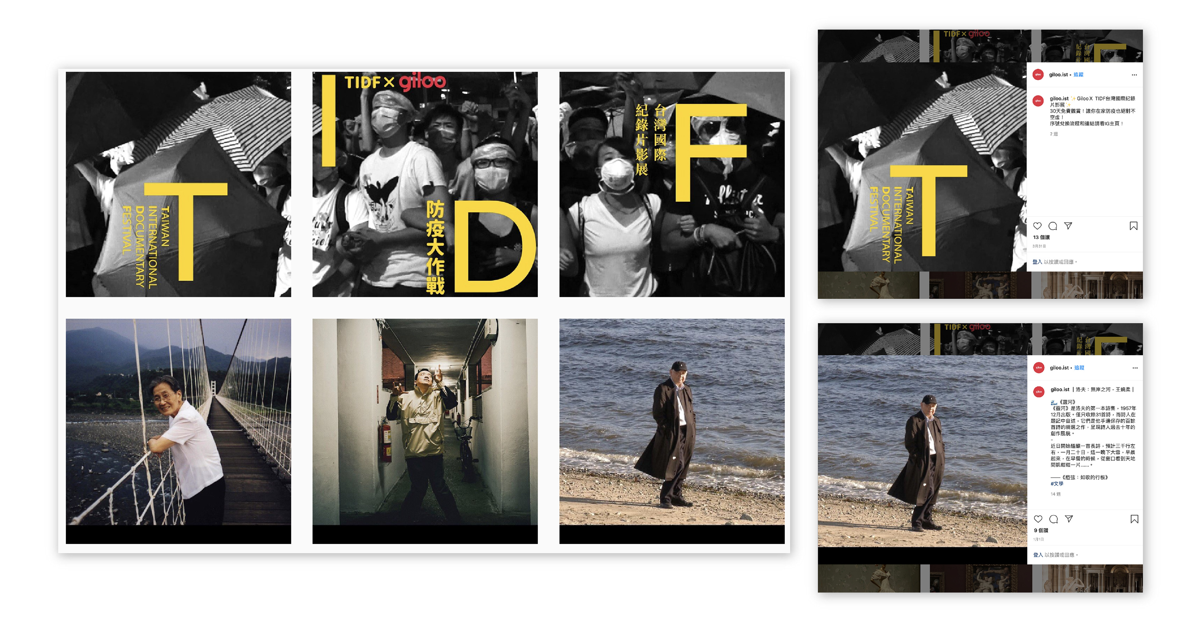
Screengrab from Giloo’s Instagram

Screengrab from competitor (Netflix) Instagram
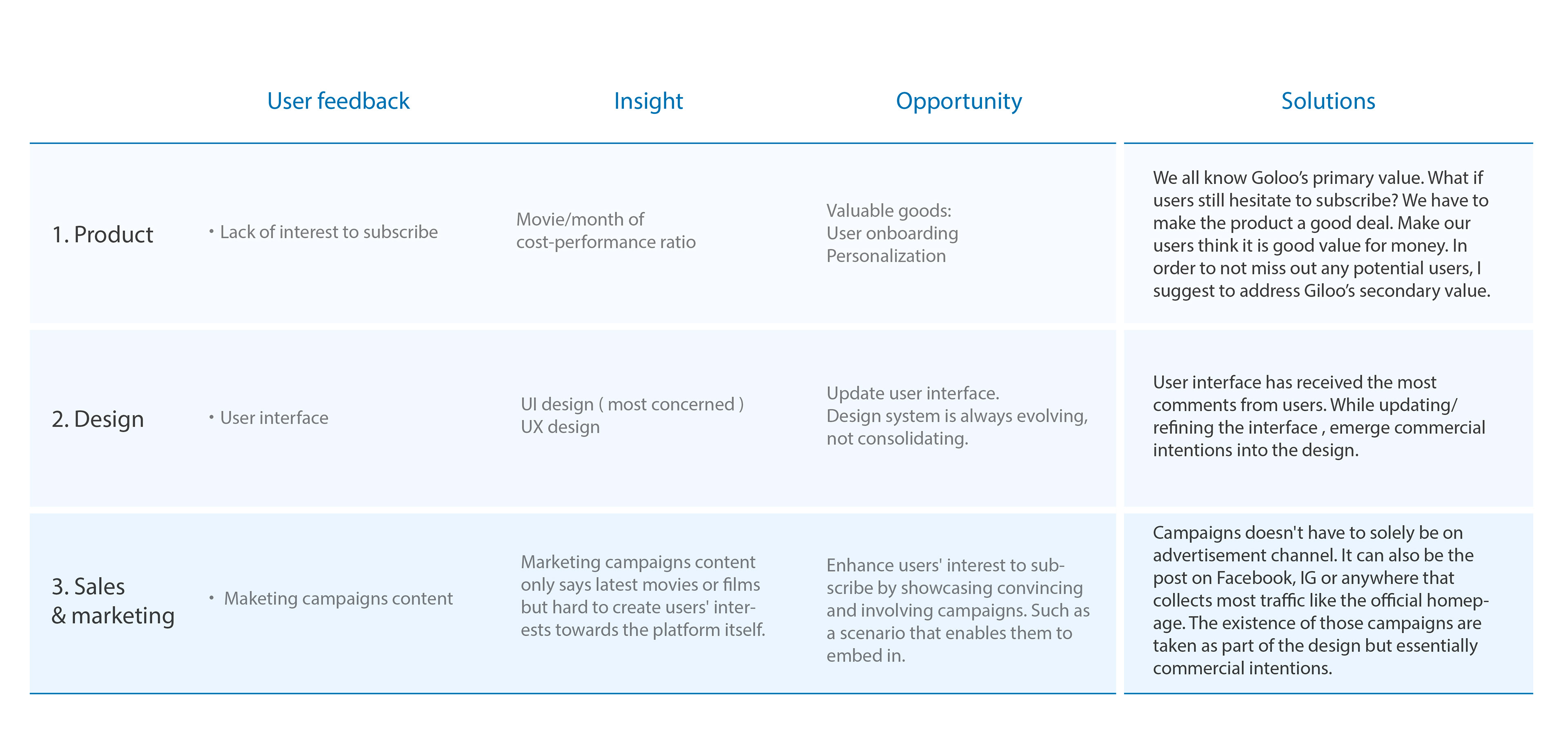
Analysis process
・User feedback
・Insight
・Opportunity
・Possible solutions
Possible solutions
Based on the problems stated above, one can see that Giloo has played a characteristic role in this industry. However, we still find some issues from product, design and sales/marketing perspective. Therefore, here are some possible solutions :
Conclusion
What’s next?
To have a concise summary, I try to be neutral when investigating a product. Categorizing all feedback from Giloo’s users is a good way to know how the issue interacts in product, design and sales. Although this study did not capture everything an UX or the team can possibly do in the design process but has already revealed some problems. To dive into the problems, we should start reviewing the current user flow to explicate the cause and come out with more possible insights and solutions. The next thing I would do is to verify my solutions -- interviews with prototypes, to see if the new user flow connects each step well and if it does solve the problem we stated!
I believe that UX designers stand at the intersection of technical, design and the market which require to work with multidisciplinary members since every decision can impact accordingly aspects. This is my point of view and I was honored to have a chance to talk to James, Product Lead of Giloo and exchange our ideas about the problems I pointed out above.
Chia Ling Chen
UX Design・UI Design・Product Designer
Open to relocate.
Thank you for your time and attention.
If you are interested in discussing further about my work, please get in touch with me at chialing83@gmail.com
If you are interested in discussing further about my work, please get in touch with me at chialing83@gmail.com