Who am I in this project?
Senior UX Designer, Asus Intelligent Cloud Service
What tools did I use?
Figma, Figma Mirror, Zeplin, Adobe Creative Suite
Who did I work with?
1 Product Owner, 2 Project Managers, 4 Front-end & 4 Back-end Engineers, 2 Data Scientists, 4 Hospital stakeholders & 50+ Sponsored Patients
What skills did I use/learn/gain?
User Interview & Analysis, Ideation, Wireframing, Design Guideline, Interface & Interaction, Rapid-prototyping, Cross-Functional Communication, Usability Testing Planning & Implementation, Quality Assurance Testing, Design Iteration
How did we measure success?
・Monthly Active User
Grew to 5.5K users from 0 in the first 30 days of launch
・Monthly Return Users
Gained an average of 7.2K users
・In-app Rating
97% of high satisfaction from 47% of total users.
・App Store 4.1 ratings
・Google Play 4.8 ratings
How did this project perform?
Selected top 3 annual priority projects within the division in 2021
Our vision
CandyCloud offers Healthcare Customer Relationship Management System combined with Mobile Personal Health Services for AI-powered and Data-enabled era. I was mainly involved in mobile application development as it was where our project started. The application provides advanced healthcare services to patients, including functions such as online appointments with AI recommendations, medical records management, real-time outpatient calling, and online payment to streamline and optimize patients' personal healthcare experience.
Background research
How big is the healthcare market in Taiwan?
Over the five years to 2020, every month, data has shown that about 20% of outpatients make appointments from the website. Our team aimed to integrate users from different funnels to the application while gaining users from other hospitals. In the first 2 quarters after launch, the overall user base is expected to thrive from 0 to 18k including the growth of 10% in-app users every month.
To continually boost the number of users in the first year, we are seeking to grow 10% of total application users every month along with new features. To expand our market, we are targeting to deploy this system in 5 hospitals a year.
Target audience & Product roadmap
Our audience ranges from teenagers to elders who have joined the National Health Insurance System in Taiwan. (This insurance is mandatory and 99% of people in Taiwan has joined)

Sprint overview
Our sprint starts with the insights from research and interviews that project managers and I lead with patients in hospitals. The project managers, designer, and lead developer will then prioritize the features paired with our product roadmap. We will define our sprint with a clear product requirements document and an agreed timeline. As the lead designer in this project, I worked closely with the product owner, project managers, lead developers from the front-end and back-end, and data scientists. Besides the design process and deliverables, I was also in charge of interface examination and overall user experience quality control during QA.
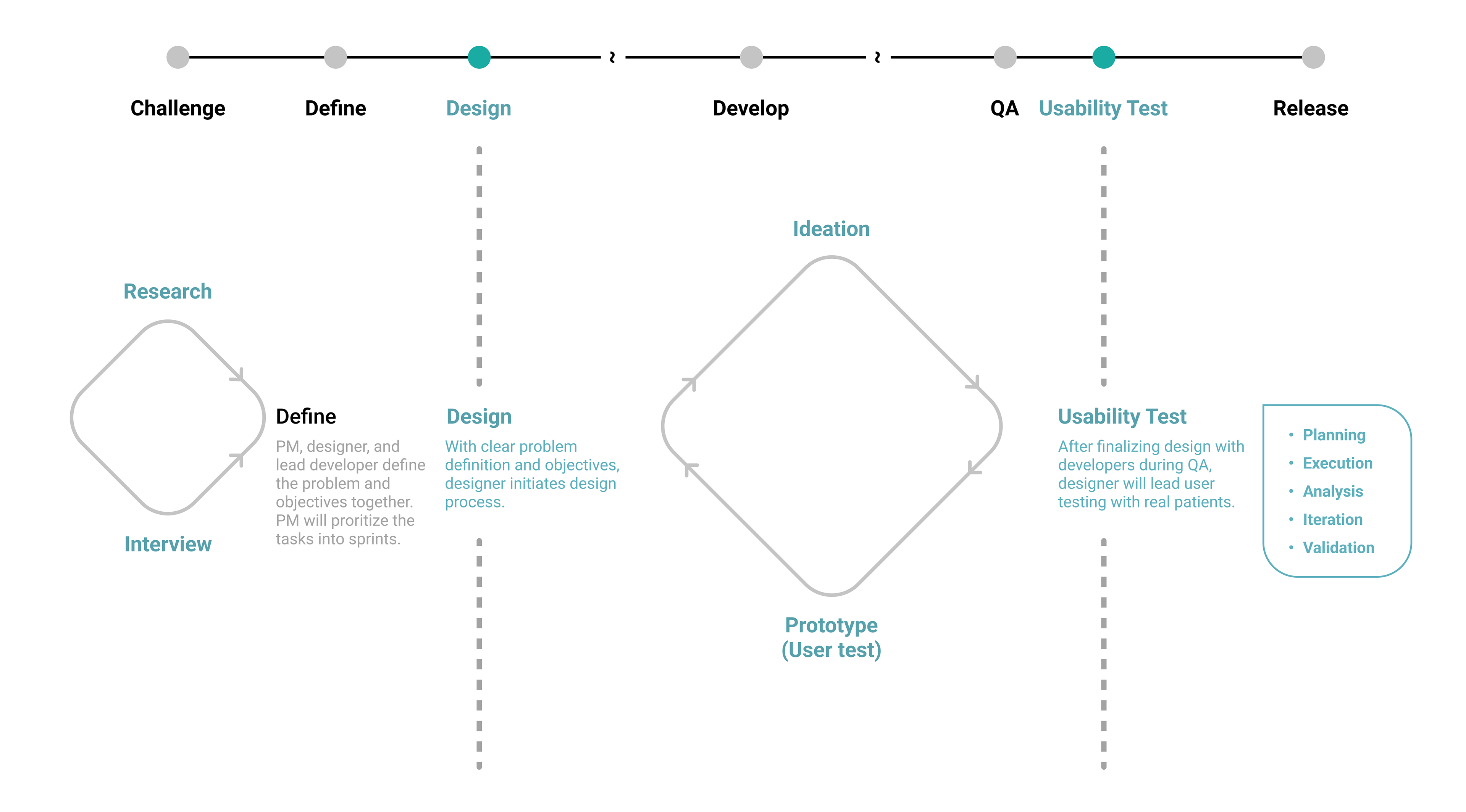
Sprint Process Overview
(Green parts are mainly my responsibilities )
Key design features
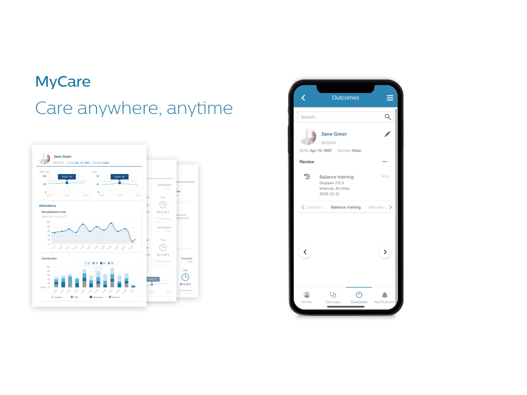
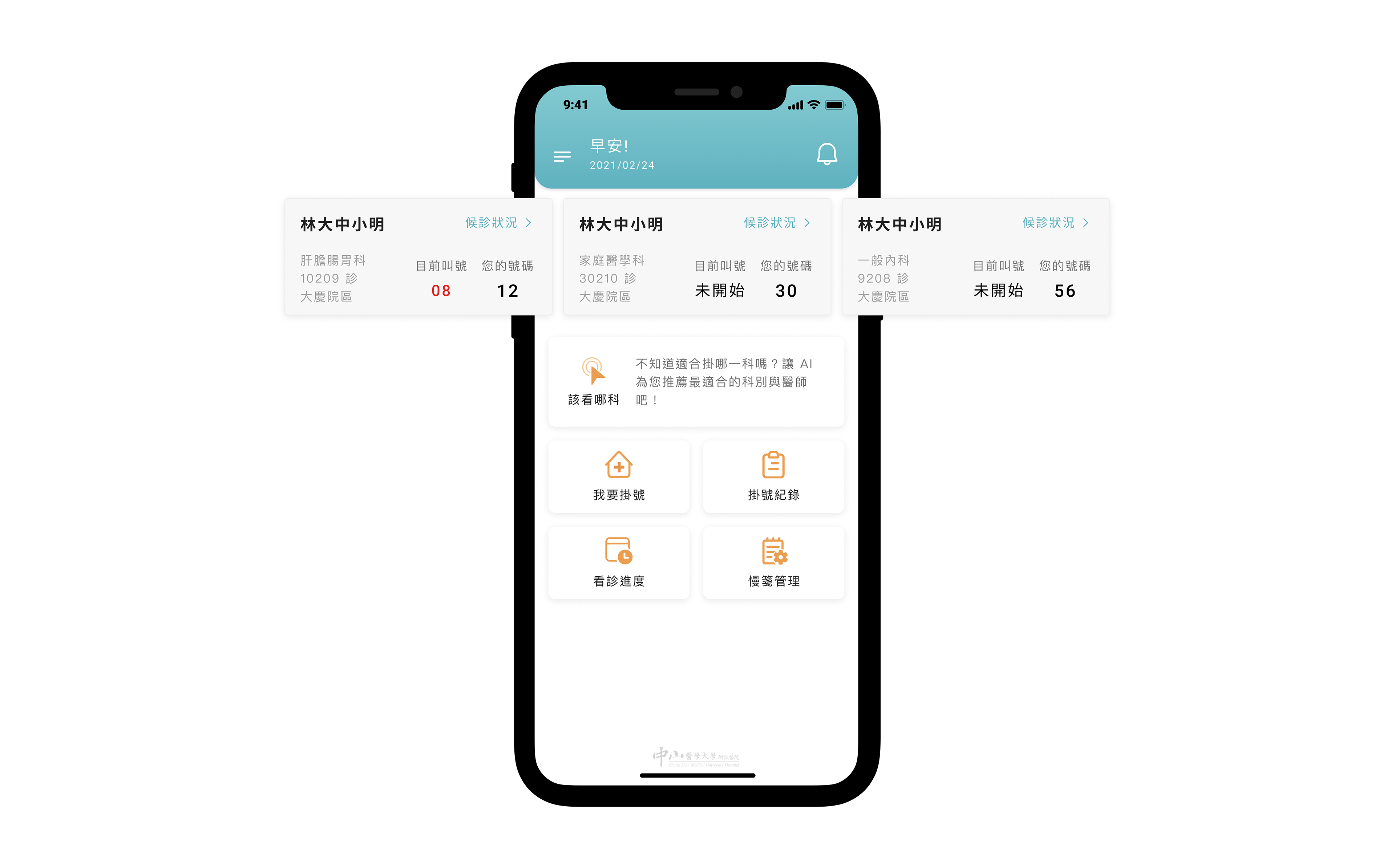
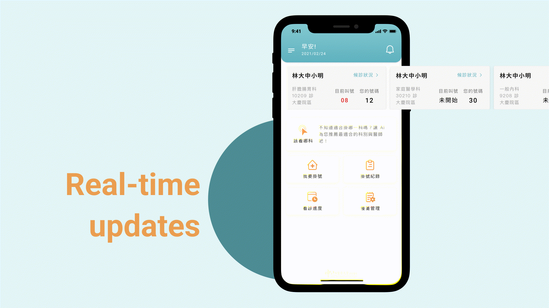
a) Dashboard
The dashboard enables patients to assess the status of their appointments by providing them with real-time updates that replace the need to wait on the site and reduce missing their turns. Patients are also able to see their family's appointment update if their family is added to the profile management contacts.
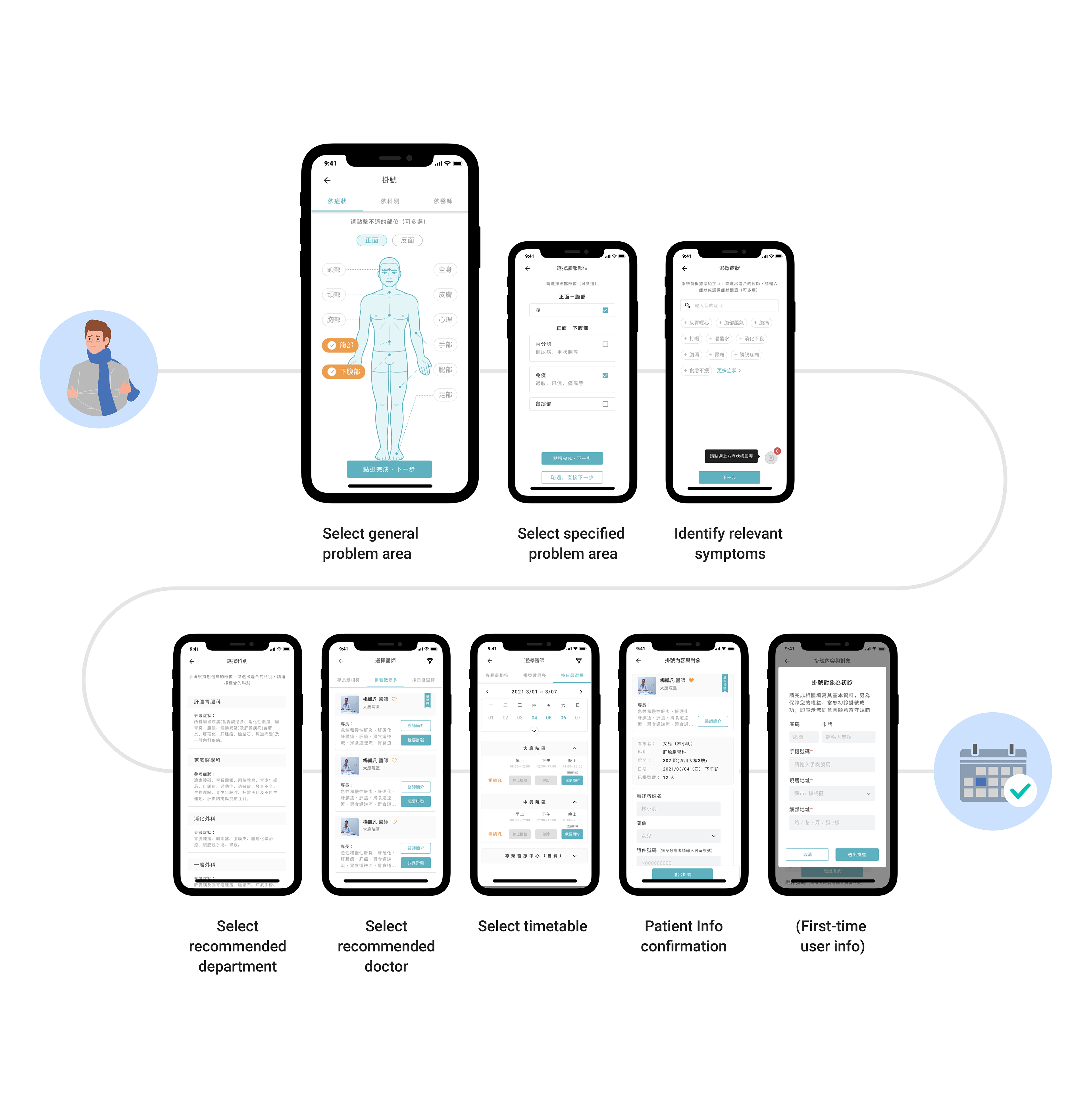
b) Make appointments with AI assistance
Our application leverages AI to help patients find the most suitable departments and doctors to consult with and make appointments based on each person’s different symptoms. In the application, you can also reschedule and cancel appointments which are immensely important for convenient communication between doctors and patients.
Our application leverages AI to help patients find the most suitable departments and doctors to consult with and make appointments based on each person’s different symptoms. In the application, you can also reschedule and cancel appointments which are immensely important for convenient communication between doctors and patients.
c) Highlights
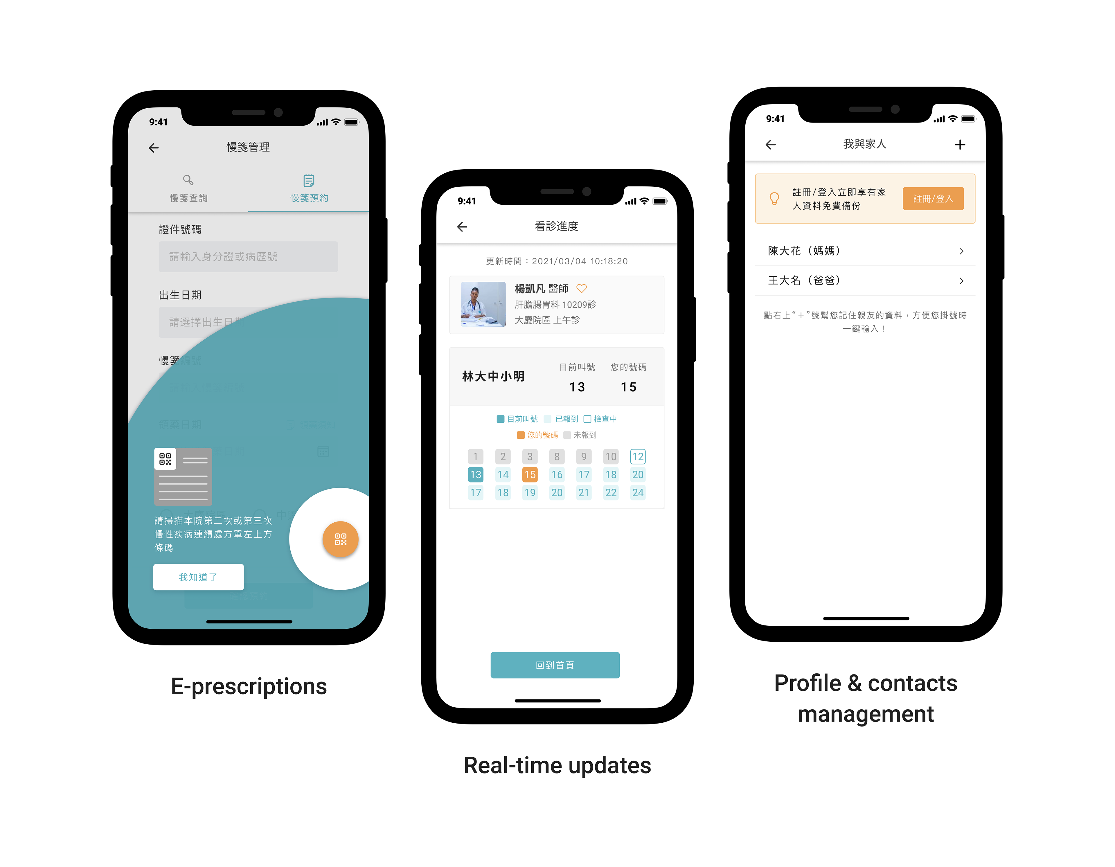
E-prescriptions
Processing medical prescription refill on mobile is way faster than in-person. It also notifies patients when a refill is coming up to ensure sufficient medication for their daily use. This feature is iterated from simple one-time prescriptions to multi-refilled prescriptions to record management so that patients can supervise their medication smarter in one place.
Real-time updates
With real-time updates, patients are able to check in appointments progress whenever and wherever they are.
Profile & contacts management
This feature helps patients to make appointments for their families in an easier and more efficient way.
d) Future steps
Our App seeks to incorporate payment, electronic medical records, and wearable devices in the near future. With internal integration and external expansion, we aim to complete a medical ecosystem that enhances the quality and accessibility of personal healthcare.

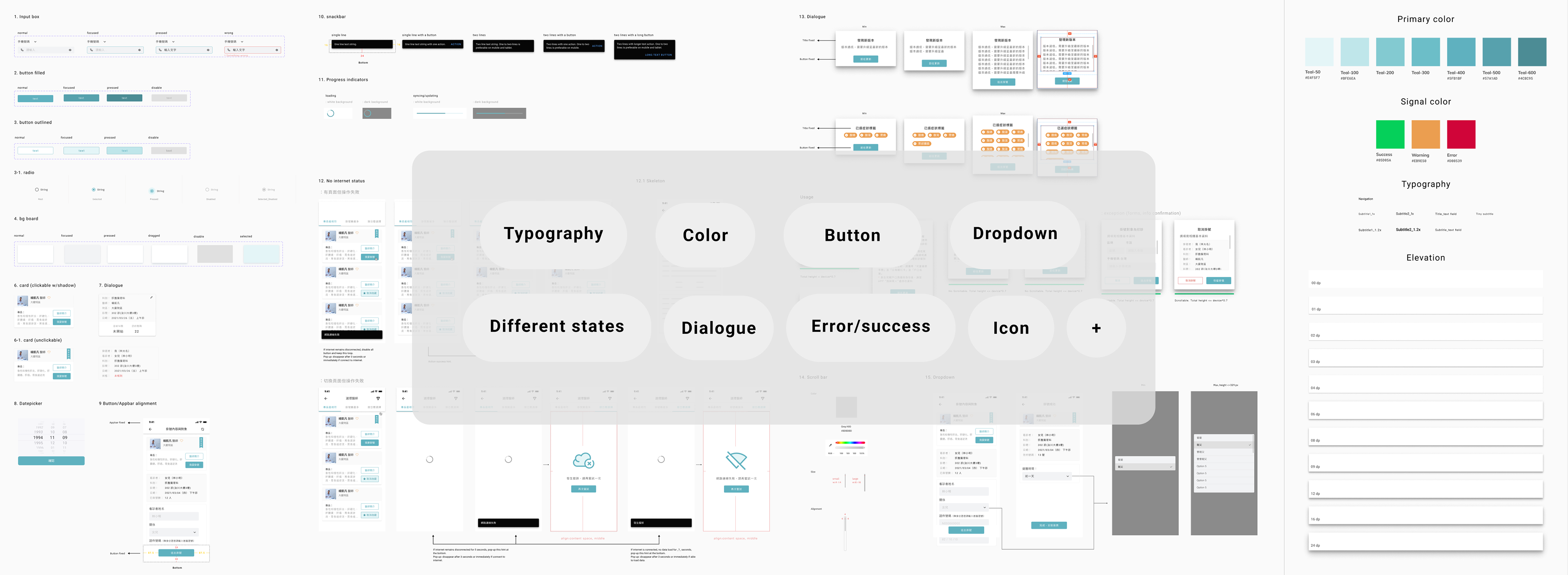
Design guidelines
Prototype
After ideation, I will produce rapid prototypes for user testing to ensure the solution is usable, feasible, and valuable before moving forward to developing an implementation. Final design deliverables include optimized user flows, detailed design guidelines, and interactive and responsive interfaces.
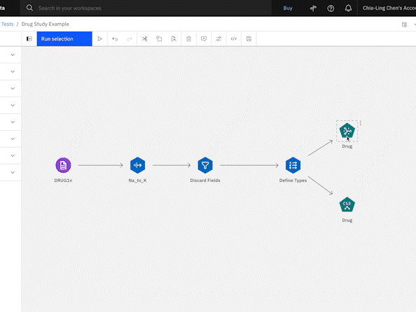
Prototype Example
Usability testing process
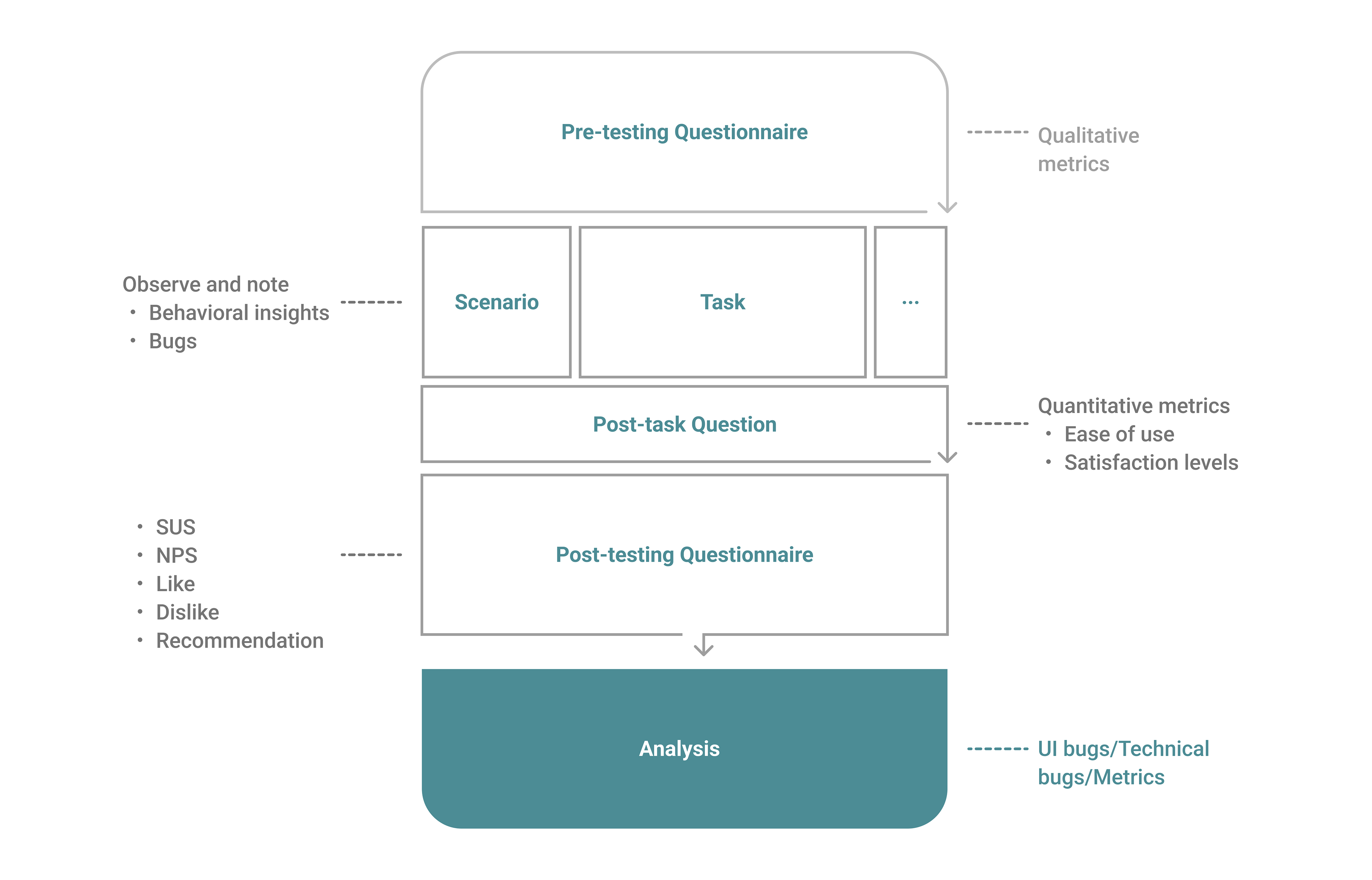
a) Planning
I am in charge of user testing from planning, execution, analysis, and amendments. Within every sprint, usability testing plays a profound role to determine whether our features are qualified to be launched. We made sure that QA is followed by usability testing, therefore, our users have ready-to-go functional features to test out. To accommodate pandemic restriction, we shifted the preparation meetings remotely with hospitals and patients while testings remained in person.

Usability Test Plan
Usability Test Design and Rationale
b) Execution
Moderating technique
・ Concurrent think-aloud (CTA)
・ Retrospective probing (RP)
・ Concurrent think-aloud (CTA)
・ Retrospective probing (RP)
Onsite face-to-face testing, 8 users every time
With assistance from the hospital, we recruited a pilot team and a potential user pool to be our interviewees in the need of different purposes. For the new features exploration and research, we tended to reach out to both groups to gain a broader view of perspectives. On the other hand, for the iterating features, we leveraged our pilot team to do regular usability testing for prompt feedback.
Take one of the usability testings we conducted for instance
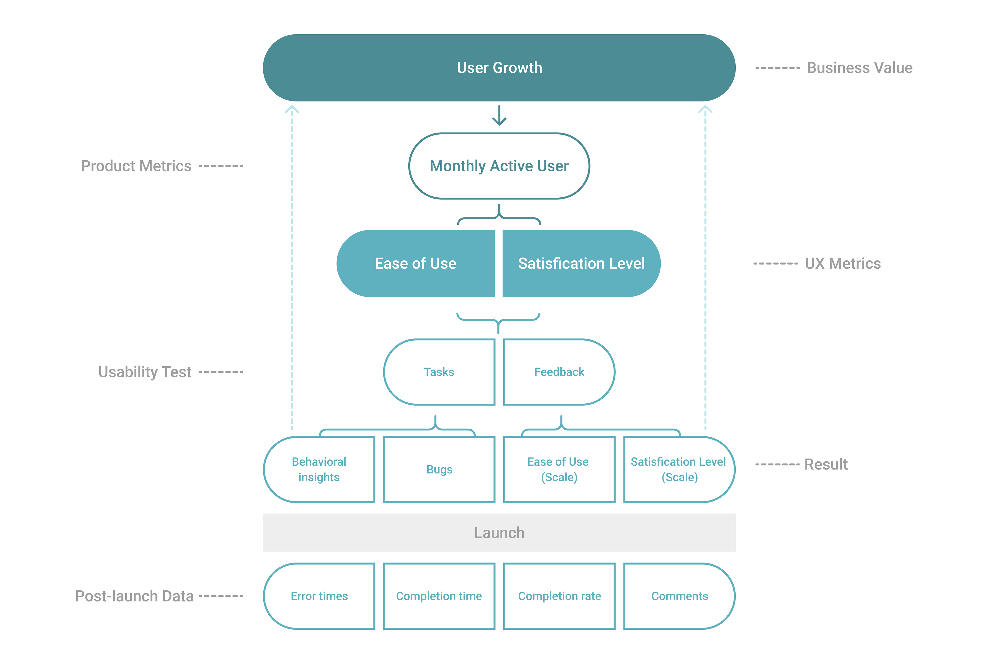
Our primary product metrics: Monthly Active Users
Our top-line UX metrics: Ease of Use and Satisfaction Level
Usability testing: My methodology is designing tasks derived from key features that can test out bugs and receive direct behavioral insights and feedback from users. The data and results we gathered provide a direct and measurable link between UX and business value.
Usability Testing Process
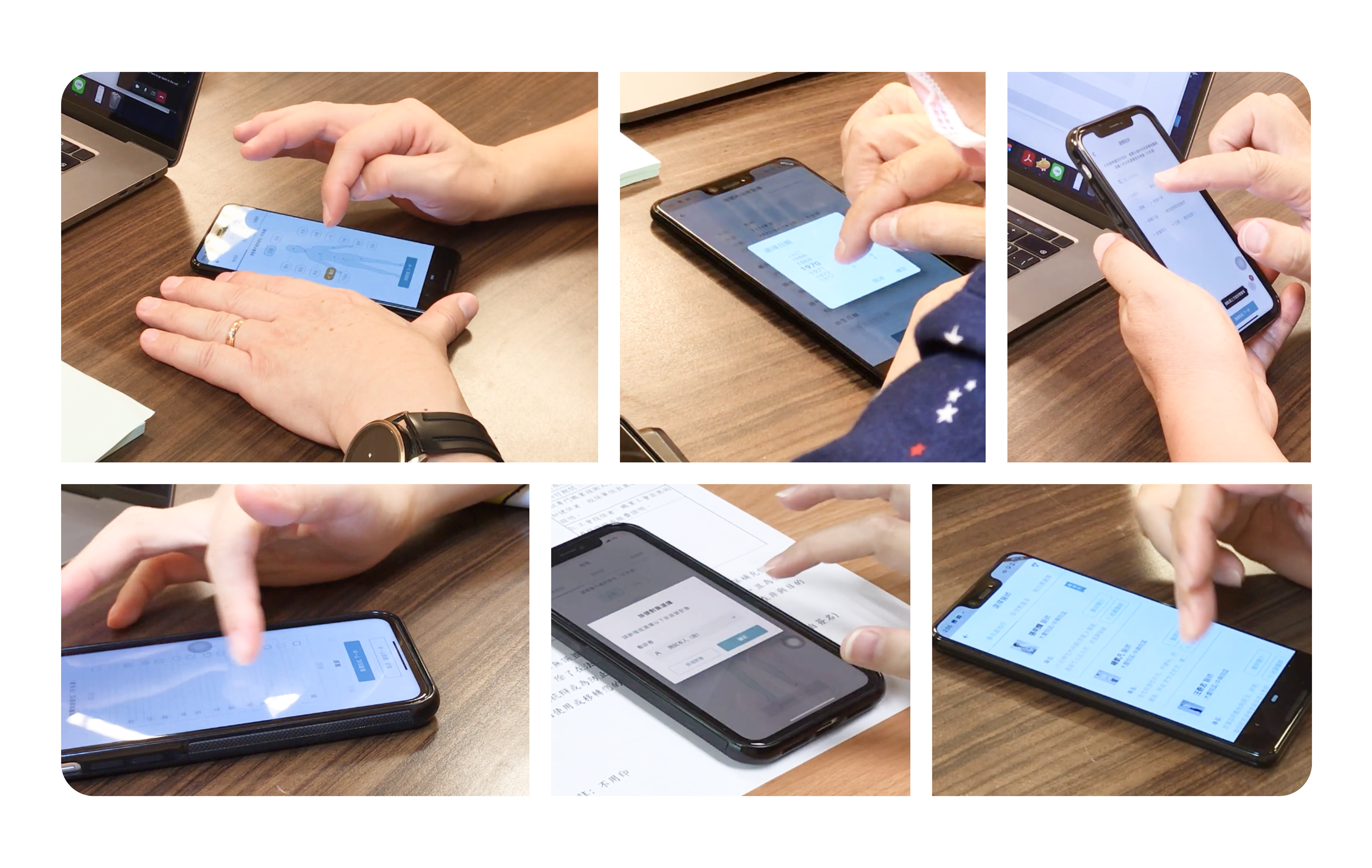
On-site Usability Testing
c) Analysis
Behavioral data to ratings to comments
Based on what we learned from user testing, the designer will gather insights and communicate with the team to prioritize crucial action items that have to be done before launch to ensure the quality of the experience. After launch, the designer will work with the team to monitor metrics from the data log, check ratings and comments every day from iOS and GooglePlay platforms in order to be aware of any issues firsthand.
Industry metric benchmark

NPS (left) and SUS (right) Indicators
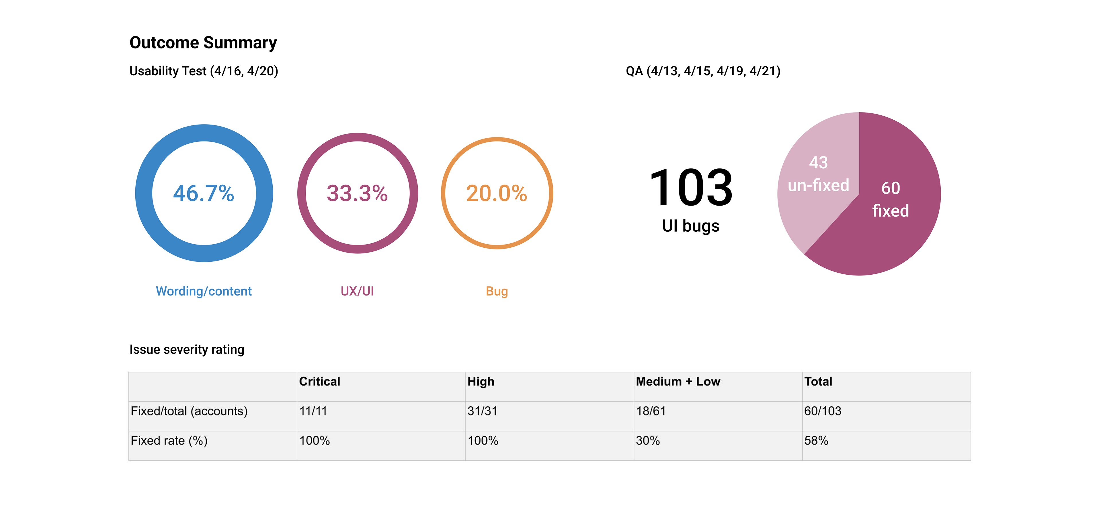
Usability Test Performance Report
d) Amendments
Usability testing embodies its value when we learned things from it and take action to address the problems we observed. Although we have tight schedules we make sure those marked critical and high severity issues are fixed and tested before launch.
Iteration
Example: High demand to make appointments from department tab
Insights: Based on data, we realized that more appointment requests were made by the department tab than we forecasted before. Thus, we shifted the department tab as the default entry point instead of AI Assistance to save more time for patients. Also, we looked into the data on average completion time that was longer than expected and decided to enhance the user experience.
Iteration objective: Lower completion time and enhance user experience
Result: Average appointment's completion time has been decreased by 26% while the completion rate is increased by 15%.
Iteration Example
Validation
Metrics to business impact
After launch, data monitoring and comments reviewing became part of the daily routine. Every iteration was based on insights into the data and feedback from users. For me, validation plays an increasingly important role in the product development process. It is always crucial to dig out why do certain phenomena occur and if our solution addresses the cause of the root. Thus, I tend to map all these improvements from the data to a business metric to reflect a direct and measurable link between good UX and good business. This also offered an opportunity to review how I perceived and interpreted needs and what choices and decisions I made.
Success metrics
Monthly Active Request (MAR)
Despite the Monthly Active User metric, we also took Monthly Active Request into the long-term measurement. We took each key function such as making appointments, checking real-time status, making e-prescriptions as one request to monitor whether/how the application provides useful and valuable benefits to personal healthcare for patients.
Monthly Active User (MAU)
MAU offered an insight into which degree our application is successful in producing the desired function for patients. We value its importance the same as MAR to reflect on each milestone's success and as a link between outcomes and business impact.
According to the data, our application struck an outstanding milestone in our division. Although I have left the company, I am sincerely grateful to be part of the team and excited to see its continuous growth and success.

Lesson learned
Design consistency
Delivering a series of human-centered designs in a large organization is difficult. However, as a designer, I have a responsibility to establish design guidelines alongside our design system. To do so, I figured out an efficient way to align with other designers while everyone remains workflow synchronous. I proposed a review time for the design system after the weekly design meeting to make sure all changes are added and everyone is up-to-date.
Team workflow
Establishing a seamless workflow requires a lot of effort from every stakeholder. Our teamwork was not as efficient before we introduced sprint to our team. During the transition of sprint implementation, I worked with project managers to seek the best practices of centralized information and streamline workflow. Our team also brought in retrospectives to continually improve and review every sprint performance. In the end, we successfully built up a high-quality and fast-paced work dynamic.
Integration (External and internal scalability)
Customized solutions are often a lesser of two evils because a one-size-fits-all approach rarely works for different hospitals. Each one has its own rules, scale, level of technical ability, and internal processes that need its own custom solution. The idea to develop a custom mobile app will pay off because it will fit the needs exactly as it should. We are aiming to develop systematic modules targeting large hospital chains in Taiwan to find relatively similar conditions to deploy our service.
My reflection
Technical excellence
・ To accommodate our engineer resources, I have put extra effort and creativity in defining iOS and Android design into one hybrid design guideline to provide our users with a seamless user experience on both platforms.
・ To fit in with a wider range of users, especially elders, I have created a design that can adapt from small (x1.0) to large font (x1.3) size without compromising user experience.
・ To improve upon conventional ways of doing things with project managers, I introduced a wireframe tool and helped interpret PRD with a better understanding of wording on a systematic level.
・ Defined and implemented design guidelines to enhance work productivity for developers and project managers by saving back and forth communication.
Mission mentality
・ I didn't let changes interrupt my workflow, but instead aim to roll with the adjustments to keep projects on track.
・ I've gone above and beyond my job description to ensure our team operates at an optimal level, staying late and helping others whenever it could contribute to our collective goal.
Strenuous attempts
・ I provided constructive feedback on the obstacles we faced in the product development process and accepted the same from team members and management.
Innovative creation
・ Facilitated good communication and helped rally the team when cooperation is needed to meet a deadline or solve problems.
Chia Ling Chen
UX Design・UI Design・Product Design
Open to relocate.
Thank you for your time and attention.
If you are interested in discussing further about my work, please get in touch with me at chialing83@gmail.com
If you are interested in discussing further about my work, please get in touch with me at chialing83@gmail.com